Colour Stories. Indigo.

Once in a while a colour (or more) starts speaking to me. I can't really explain how this happens, it's sometimes a fleeting feeling, an intuition you might say, or sometimes it just appears in my mind very vividly. And sometimes I might see it somewhere and fall in love instantly.
This blog series is a story of these colours.
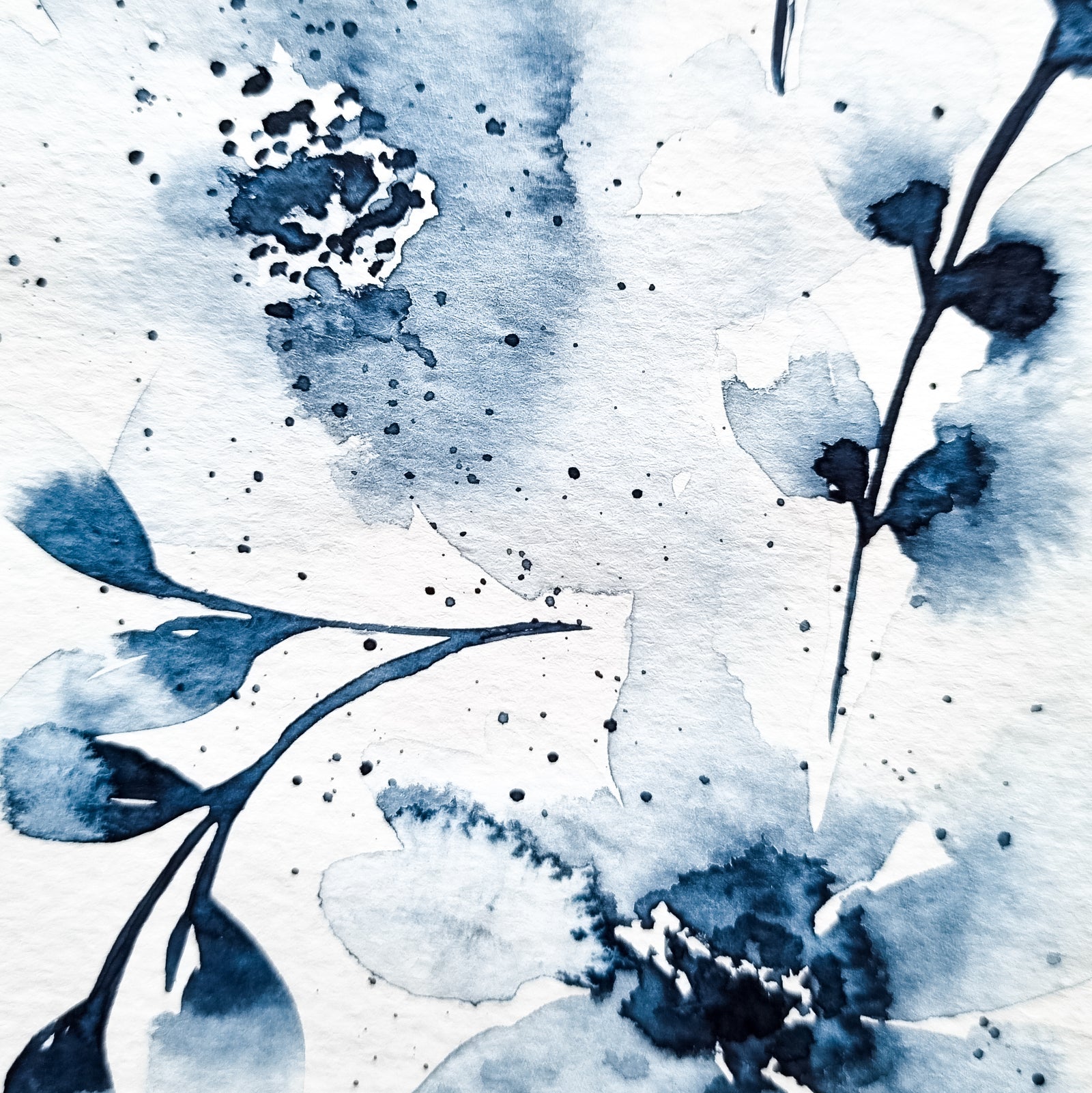
The first colour that spoke to me in this way was indigo. It was such a crazy connection, for more than 2 years I couldn't even touch another colour. I just painted indigo. I still find it the easiest to paint with it and it is still my absolute favourite colour, even though now I do work with other colours as well.

I think it would be so interesting to understand why this happens, and what the colour is trying to tell me. But for now I don't have the answer to that. What I can say is that indigo came into my life when I started really focusing inwards. It was such a sudden shift, as I went from being a total social butterfly to well, sort of a hermit. Situations changed in my life, I moved countries, changed the whole focus of my life, became a yoga teacher, an artist, yes all this happened and you could say it's because of the circumstances that I became an introvert. But I feel like it was the other way around, it's the focus inward that created everything on the outside. It wasn't an easy move, as you can imagine, it hurt so much, and the pain was unbearable sometimes. I missed my old ways and my old life. But in the times it didn't hurt, it felt blissful, I was at ease for the first time in my life, I was coming home. So this is where indigo found me and I think this contrast of extreme pain and bliss is what came through my paintings back then. Indigo is really a colour that can create this dramatic contrast effect.

Most colours need a companion, or more. Indigo is a lone wolf. Just like me in a way. It's the only colour I found that works so well on its own. The value range it creates is just incredible. You can understand really well the power of a colour by playing with water and transparency.

If you're looking for more technical details and brands that I use you will be a bit disappointed that I don't have a particular one I work with. I usually mix one or more indigo tubes to get the colour I'm looking for. The brands I like most for indigo are Winsor&Newton, Schminke and Qor. I sometimes would add a bit of Payne's Grey to make the painting more muted, or Indanthrene Blue if it wants to be more vivid, it all depends on where the painting wants to go, my process is always very intuitive.
I hope you liked this little colour story, I will share more in the future as the colours reveal themselves to me.
Leave a comment
Comments will be approved before showing up.
Also in Stories

Why PLAY isn't just a phase - it's the essence of art making
Creativity isn’t about getting everything perfect - it’s about playing, exploring, and seeing where the process takes you. For years, I thought play was just the messy beginning of art-making, something to grow out of once I got “serious.” But the more I create, the more I realize that play is the heart of creativity. When we let go of perfection and embrace curiosity, that’s when the real magic happens.

Warm Embrace colour palette
I have been on a colour exploration, trying to make a colour palette to match the energy of the changing season.
I called it Warm Embrace.
Like the sweet autumn sun, gently whispering now, changing from the loud summer energy, but not yet completely gone.
